

EDUrain Landlord Onboarding
Click pictures
for expanded
& in-depth
views
Project: Two week design sprint to streamline the landlord dashboard.
My Role: UX Project Manager
My Team: Annette Vu - UX Researcher
Damion Rankine - UX Project Manager
Scope of Work: To streamline the landlord dashboard and onboarding process while ensuring that all parties have access to the resources they need to be successful when renting to student tenants.
Research Objective:
To understand our users' habits and goals while using a landlord dashboard in order to design a feature that is intuitive toward their needs.
Discovering the Problem:
Affinity Mapping
After clearly defining our research objective we decided on 11 research questions and 12 survey questions. I conducted five interviews to encapsulate our primary user base’s answers to those questions. We then mapped out those insights to create our affinity map and pulled out the most significant trends from them to focus on.

Our key takeaways were that communication between all parties is essential, advertising to students while staying compliant with Fair Housing Laws is difficult and that a landlord dashboard needs to provide a substantial amount of easily accessible information at the user's fingertips.
While I was doing the user interviews and collecting key information from our client, my coworkers collected a vast amount of research on the EDUrain website as well as it's Competitors and Comparitors: Task Analyses, Content Analysis, Heuristic Analysis and Dashboard Analysis were all among the research that was conducted. Through this research we were able to note where EDUrain was lacking and what they did well, as well as gain some clear understanding of what should be included in a successful onboarding and dashboard.
Defining the Solution:
We then captured the key insights from all of our research into one User Persona that we named Claude. Claude is a property manager who has greater than 10 properties, some of which he prefers to market as shorter term rentals to students - as they are close to major Universities.
User Persona
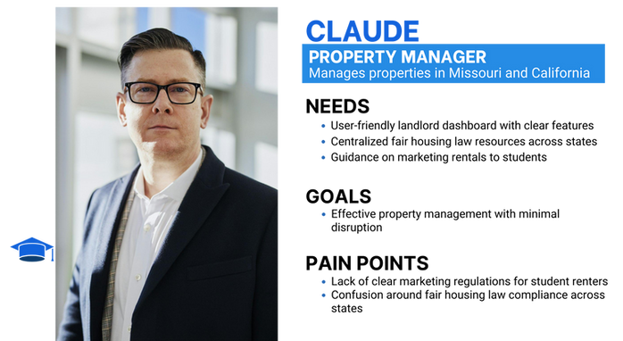
Claude is excited to find a platform that can help him meet that goal, but does need a bit more guidance to ensure that he is compliant with the law and can communicate with his renters effectively.
Figuring out Claude's needs led us to the development of our Problem Statement and How Might We questions.
Problem Statement:
Landlords are having a hard time communicating with college students because they lack understanding of the unique circumstances and needs of students.
How Might We...
...supply landlords with adequate resources to communicate effectively with students?
...equip landlords with the knowledge and tools to effectively reach and engage college student renters?

Feature Prioritization
Using those ideas, we were able to ideate on a mass of features we thought might solve those problems.
Through Feature Prioritization we were able to narrow down our area of concentration to three things that - when combined into one easy to use resource - provide for Claude's most pressing needs quite efficiently.

Prospective Journey Map

We then took Claude on a Journey through the new feature we were proposing to see how it would improve his outlook on renting to students through EDUrain.
Designing the Solution:
Sketching my Ideas

I always find sketching to be so fun! We all got together and quickly sketched at least three ideas each of what we thought the onboarding, the fair housing information and the communication pages would look like. We then compared notes and took the things we liked from each sketch to start our low-fi wireframes. Sketching is such a quick and easy way to get those creative juices flowing!
Low Fidelity Usability Testing


Mid Fidelity Usability Testing
I conducted usability testing for our low fidelity screens with three users who were each given 11 tasks to complete.
Our most common error trend in our Low-Fidelity usability testing was that users struggled with understanding the Lorem Ipsum. One user did note the redundancy of having login buttons in two places on the main screen, though.
Our most common and notable hesitation was that 2 users did not realize that the messages from the tenant in question were already displayed on the other side of the screen - and they asked which message to check.

I also conducted the testing for our mid fidelity screens with three users who were each given 10 tasks to complete.
-
None of the users completed the onboarding as they did not realize there was more than one page.
-
When looking at hesitations - a funny but unintended action happened. When users tried to scroll back up after viewing the Fair Housing Laws 2 of them were unable to do so without significant struggle!
-
Another significant hesitation was that users found some of the buttons they were intended to use, hard to locate due to their smaller size.
Accessibility Considerations:
When we were ready to add in full color we also tested the current colors because we wanted to be sure that we were providing as much accessibility as we could for those with vision differences. I upgraded EDUrain’s palette so it surpassed WCAG 2.1 standards and was more easily accessible to everyone and checked for colorblindness issues as well. I also modernized the footer to ensure readability.
Retrospective

Prospective

Delivering the Final Product:
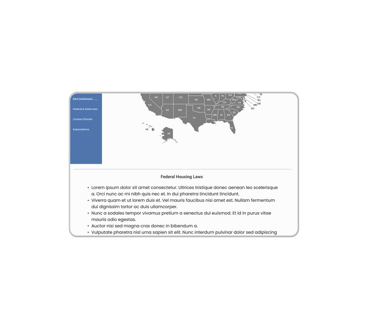
We had great success with our High Fidelity usability testing! On our first test I spotted that an Edit button went missing and fixed it mid-test, which did cause a slight hesitation in testing. I also had one curious user who got himself into trouble clicking a link we didn't mean for him to click which caused our only error. Our third user testing the High-Fidelity prototype was quite curious about the Fair Housing laws in each state and stated she would be happy to dig in and see which states she might like to own more homes in.
Our next steps for our High-Fidelity prototype would be to consider further Accessibility testing as we only had time to ensure color testing and button sizing was adequate during this two week sprint. We also should consider alternate methods of ensuring that there are no hidden links in the prototype such as highlighting the words as the user hovers over them. Lastly we would need to consider a method to ensure that the fair housing laws bullet pointed for each state were able to be maintained and kept accurate and compliant.


See the Prototype:
Key Takeaways:
While I had a good grasp on interviewing due to my social work background, and also about accessibility and usability testing due to previous projects, I learned during this project that there is always room to grow in my knowledge! I dove much deeper into the WCAG 2.1 regulations and learned how to find and connect with users from a niche market.