
DuoLingo Feature Concept

Introducing DuoLingo's Media Center: a new feature designed to bring the language you are learning into your everyday life!
Click pictures
for expanded
& in-depth
views
Project: Two week design sprint designing a new feature for DuoLingo that increases user retention and learning rates.
My Role: UX Designer
My Team: Bradford Schiebel - UX Researcher
Rachael Sekamwa - UX Project Manager
Scope of Work: To design a feature for the existing platform that integrates seamlessly with the current model while enriching the users learning experience.
Research Objective:
To understand our users' habits and goals while learning in order to design a feature that is intuitive toward their needs.
Discovering the Problem:
After clearly defining our research objective we decided on 11 research questions and conducted two interviews a piece to encapsulate our primary user base’s answers to those questions. We then mapped out those insights to create our affinity map.
Interview Affinity Map


Comparative SWOT Analysis

We compared DuoLingo to three other learning sites in a Comparative SWOT analysis to find the most helpful and harmful insights from each.
We also conducted a competitive Element Analysis to ensure that our feature would compare well to other language learning apps.
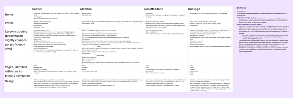
Competitive Element Analysis

Competitive Feature Inventory


Lastly we conducted a Competitive Feature Inventory to compare the features between each of the three apps we tested and DuoLingo.
We were able to walk away with four key insights from all of this research:
-
The gamification elements in Duolingo are well liked by users and give the app an upper hand
-
Duolingo offers the most features in comparison to the competition
-
Our comparators have access to learning databases that Duolingo does not offer
-
AI is a common trend amongst our competitors and comparators alike
Defining the Solution:
User Persona

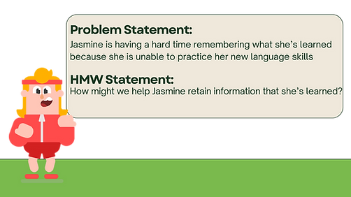
We created the persona Jasmine "JJ" Jones based on our extensive research and affinity mapping. She encapsulates the essence of our users into one persona.
After we defined who JJ was we took some time to brainstorm where her Pain Points were when using DuoLingo - through Journey Mapping - and then to think about what she might like to see. This led us to our problem statement and our final HMW question.
Feature Prioritization
We then had a session trying to think up the most creative ways to help JJ overcome her struggles and teach her something new in a fun way. After writing all of our ideas down individually, we mapped them out to help us find the feature with a lower cost and yet still a high impact. We compared that with the time we had available to enact this feature, and with this information decided on our final feature.

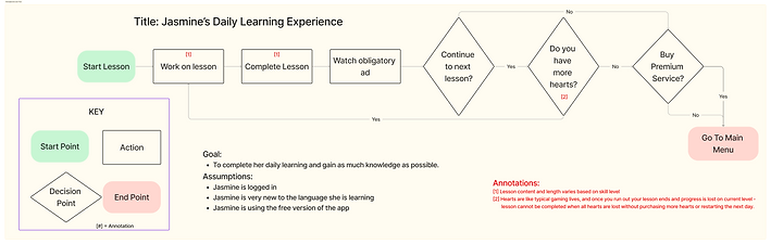
Then we took a bit of time to map out Jasmine’s current User Flow and how our new feature might impact that flow. You can see that initially her user flow ends with the end of her lessons, and now we have a whole new section for Jasmine to peruse at her leisure and to go back to as often as she wants without the possibility of having to run into a hard stop.
Retrospective User Flow
Prospective User Flow


Designing the Solution:
Media Center Landing Page Sketches

Once we defined the problem and what we planned to do about it, we spent time sketching various ideas of what that first landing page might look like when we get into the new Media Center Feature.
After sketching we had a good idea of what we were wanting to see so we refined those sketches a little more and started our wireframes!
Low Fidelity
Screens
We learned a lot about our Low-Fidelity wireframes through user testing. Users wanted back buttons and to be able to play the video from the still image and they wanted to know what language they were practicing. They also wanted to swipe to scroll through the text in the reading portion and they wanted popup definitions of the words they were learning.


Mid Fidelity
Screens


By implementing these ideas in our Mid-Fidelity prototype we were able to learn even more! Users wanted to go from the video back to the task page before going back to the game board. Also, the translations weren't working the way they were intended as users had no evidence they existed unless they randomly clicked the word.

Accessibility Considerations:
When we were ready to add in full color we tested the current colors because we wanted to be sure that we were providing as much accessibility as we could for those with vision differences. We upgraded DuoLingo’s primary green so it surpassed WCAG 2.1 standards and was more easily accessible to everyone and checked for colorblindness issues as well. After noting that Tritanopia and Achromatopsia will still struggle with vision differences with these changes, we ensured that our app would have suitable noticeable differences in change of status during use for this population.


Delivering the Final Product:
Using all of our research as we’ve collected it, we finally moved on to the high-fidelity prototype and testing to ensure that everything went as smoothly as we expected it to before we were able to present our fully completed new feature to our stakeholders successfully.
We received glowing feedback from our stakeholders and we able to complete this project with utmost efficiency, finishing a full 4 days ahead of schedule, leaving us plenty of time to use wisely making minor changes to enhance the feature even more fully for our users, and work out any bugs that were discovered before releasing our new feature to the public.
We also had enough time that we spent some time creating our own DuoLingo character for our feature, in line with the characters for the other features within the application. We call him Robin.


See the Prototype:
Key Takeaways:
We had a lot of fun working together on DuoLingo and creating this new feature. We learned a lot about how DuoLingo's brand works and how to work within a well established brand in order to create a feature that seamlessly integrates with a product that is already thriving. We expanded our knowledge of multiple different research methods and I really honed in on accessibility this time, not only creating a product that was accessible, but also using my knowledge to update DuoLingo's color palette while still maintaining their current branding of a bright, fun and engaging atmosphere.
